Sunday, April 29, 2012

Plot of the Week 1

Today is the first installment of Plot of the Week.  I am planning on posting a sports-related plot every week.  Some weeks I will interpret the plot; other weeks I hope that you will help post what you find interesting about the plot.


This is a scatterplot of athletes' win percentage in Majors vs. win percentage at other non-Major tournaments.  
  • I have plotted male golfers (Tiger Woods pre-scandal, current Tiger Woods, Phil Mickelson, Jack Nicklaus) and female golfers (Yani Tseng, Annika Sorenstam) in black and male tennis players (Pete Sampras, Roger Federer, Rafael Nadal, Novak Djokovic) and female tennis players (Venus and Serena Williams, Martina Navratilova, Chris Evert, Steffi Graf) in red.
  • Annika Sorenstam and Novak Djokovic are tough to read due to overplotting in the middle of the plot.
  • The solid line represents the 45-degree line (y = x) and the dashed line is the least squares regression line.
Here are the most interesting features in this graph (to me, at least):
  • Phil Michelson does not win tournaments (Majors and non-Majors) as frequently as the other athletes.
  • Graf won much more often than anyone else - over 50% of non-Major tournaments and 40% of Major tournaments.  From this view, it seems that Graf is clearly the best female tennis player, with Evert and Navratilova not too far behind.
  • Athletes close to the solid line win Majors at the same frequency as non-Majors.  This seems to represent the set of athletes who are not intimidated by the pressure at the Majors.
  • Yani Tseng is the only athlete much farther above the line - she seems to over-preform at the Majors.  It is still very early in her career, so I would not be surprised if she moves closer to the diagonal line as her career progresses.
  • The athletes below the line tend to under-perform at the Majors compared to other tournaments. But this set contains some of the best athletes ever, so this is not quite a fair assessment (Venus has 7 majors and Evert and Navratilova 18 each). Maybe it is more fair to say that they over-perform at non-Majors.
  • Federer and Nadal have very similar winning percentages.  Since Federer is 5 years older than  Nadal, it will be interesting to see if Nadal can keep this same pace for the next 5 years to catch up to Federer in terms of tournaments won.
Do you notice anything else interesting that I missed?

Wednesday, April 25, 2012

SFS Swimming Conspiracy? Part 3

This is the final part of my trilogy on referee bias against the St. Francis swim team at the state meet. You can read the first two parts here and here.

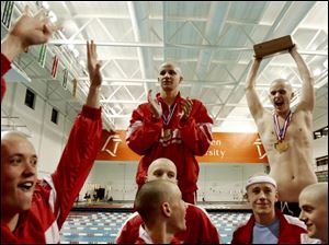
Is Greg celebrating another district win, or about to smash the trophy on
someone's head after getting DQ'ed at states?

In the previous post, I proved that SFS being DQ'ed 5 out of 61 relays cannot be explained by random chance.  So if this large number of DQ's cannot be explained by random chance, is there anything else besides referee bias that can explain this event?  Here are some possibilities:
  1. SFS swimmers are more prone to false starts.  As mentioned previously, the 5 DQ's were all blamed on different swimmers.  In fact, only 2 swimmers were on more than one DQ'ed relay (and they were only on 2 DQ'ed relays).  Unless the murky water in the St. Francis pool is causing the swimmers' muscle fibers to twitch too quickly, I don't think the swimmers can explain the difference.  But I will back this up with numbers in a minute.
  2. While the swimmers have changed over the past 11 years, the coach, Keith Kennedy, has not.  Is Keith to blame for these DQ's, or is he the muse of Lady (Bad) Luck?  In my 4 years being coached by him, he never instructed us to false start.  In fact, if anything, all of these DQ's have caused him to stress the importance of not pushing the starts.  So I'm not buying this explanation either.
You may be thinking that I am too close to the situation to blame Keith or the swimmers.  So let me finish with one last analysis that will put the "!" on this debate.  In order to qualify for the state tournament, every relay must place high enough at the district tournament to advance.  The OHSAA website also shows the Northwest Ohio District swimming results for 8 of the last 9 years (2006 is missing: apparently they are still waiting for one of the other districts to finish swimming before posting results).  The coach and, for the most part, swimmers on the relay do not change from districts to states.  

For the available data, 15 of the 529 non-SFS relay swims (2.8%) have been DQ'ed at the district meet.  This is about twice as frequent as the perennial contenders at the state meet (1.3%), which should be expected as the quality of swimmers at districts are not as high as the swimmers and relays at states.  Still, this shows that officials are DQ'ing more relays at the district meet than the state meet.  SFS has not been DQ'ed at districts in the past 11 years for a total of 33 relays (even though I don't have the district results for all years, had a relay been DQ'ed at districts, they would not have qualified for the state meet, which I have data for).  The probability that a team is not disqualified in 33 relays at the district meet if all relays are swam independently is 
(1 - 0.028)33 = 0.405

Let's do the same analysis, but using the DQ frequency of SFS at the state meet.  That is, the probability that a team that is DQ'ed 8.2% of the time at states would go 33 straight relays without getting DQ'ed at districts is
(1 - 0.082)33 = 0.059

In other words, it is highly probable that a given school will not be DQ'ed in 11 years at districts (probability of about 40%).  But schools that are DQ'ed as often as SFS at states would expect to be DQ'ed at least once at districts 94% of the time.  

Now, one can argue that because the competition is less at districts than states, that the swimmers play the relay starts safe at districts but push them at states.  But I would also expect this to hold for all  of the perennial contenders, so this doesn't explain the difference in DQ's between SFS and other perennial contenders at the state meet.  One could also argue that there is a referee bias for the perennial contenders at districts.  Why?  The officials may want the district to have a good showing at the state meet, so it would hurt the district to DQ one of the top relays even if there really was a false start.  However, it is tough to quantify this bias in favor of SFS at the district meet.

This look of the district data should show that the large number of DQ's is most likely not fully explained by the coach or swimmers, as you would expect to see similar DQ patterns at the district meet.  This three-part series conclusively shows that it is extremely unlikely that there is no referee bias against the SFS swim team at the state meet.

If you enjoyed this series, help out my ego and leave a comment or subscribe to follow my blog.


Monday, April 23, 2012

SFS Swimming: Conspiracy? Part 2

In the previous post, I introduced data showing a possible referee bias against the Toledo St. Francis de Sales (SFS) swim team.  In this post, I will use the binomial distribution to show how unlikely it is that SFS would be DQ'ed in 5 of the 61 relay races (8.2%) at the state tournament.

First, let's see how likely these 5 DQ's for one team is compared to all boy's Division 1 relay swims.  I previously showed that the frequency of DQ's for all non-SFS teams is 22/1259 (1.7%). Using the Binomial distribution with n = sample size = 61 and p = probability of DQ = 22/1259, the probability of a team being DQ'ed 5 or more times is 0.0043.  This means that if 1,000 teams would each swim 61 relay races at the state tournament, we would only expect 4 of the 1,000 to be DQ'ed at least 5 times.  This seems very improbable, so we can conclude that the probability of being DQ'ed 5 times out of 61 cannot be explained by random chance.

In the last post, I also compared SFS to the other 4 "perennial contenders", teams that have finished the in the top 3 team standings at least 3 times in the past 10 years.  I previously argued that these teams are well coached and accustomed to regularly winning, so it makes sense that these teams should be DQ'ed less frequently than all state relay teams combined.  I showed that this is true, as the frequency of a relay DQ for the non-SFS teams is 1.3%.  Using the binomial distribution again, the probability that a perennial contender would be DQ'ed 5 out of 61 swims is 0.0012. This means that if 1,000 perennial contender teams would each swim 61 relay races at the state tournament, we would only expect 1 of the 1,000 to be DQ'ed at least 5 times.  This is even more improbable than the previous analysis, so we can conclude that the probability of a perennial contender being DQ'ed 5 times out of 61 cannot be explained by random chance.

I have included the following plot to show the probability distribution of a perennial contender being  DQ'ed out of 61 relay swims.  This shows how highly unlikely it is that a perennial contender is DQ'ed even 4 times out of 61.

This analysis seems to confirm the suspicions that all SFS swimmers the past decade have had: that there is a referee bias against us.  However, the binomial distribution assumes that all trials (relay races) are independent.  This is surely not true, as many swimmers swim in multiple relays.  Additionally, each team has a different coach, so they may have different strategies and been trained differently.  I will discuss this last point in more detail in the next post.

The final part of this trilogy will try to identify other possible explanations for this large deviation from the expected number of DQ's for a perennial contender.

Sunday, April 22, 2012

SFS Swimming: Conspiracy? Part 1

Back in high school (2001-2004), I was a varsity swimmer at Toledo St. Francis de Sales (SFS).  The swim team has quite a history: 4 state titles (1967, '68, '96, '98) and 46 of the past 47 district titles.  In the past 3 years, the SFS swim team has placed 2nd (2010), 2nd (2011) and 3rd (2012).  So what I'm trying to say is that our team is badass.  And because we're badass, people obviously want to see us fail.  You may ask, "How can there be a conspiracy theory against the SFS swim team?"  This post and the follow-up posts will use statistics to prove a referee bias against SFS.

How can referee bias enter swimming?  The easiest way is to disqualify a relay team by way of false start, where an official claims that one of the swimmers leaves the block before the previous swimmer touches the wall.  The state swimming results for the past 11 years are available on the OHSAA website.  There are 3 relays (200 yd Medley and 200 and 400 yd Free).  24 teams swim in prelims and the top 16 come back for finals, with the top 8 swimming in the championship heat and teams 9-16 competing in the consolation heat.  This means that each team can swim 6 relays in a given year at the state meet.  Here is a table of the number and frequency of disqualified relays at the D1 boys' state meet by school over the past 11 years:

Number of DQ's from 2002-2012
School # Disqualifications   # Swims   Percent DQ'ed  
SFS
5
61
8.2%
Solon
3*
39
7.7%
Centerville
2**
58
3.4%
New Albany
2
27
7.4%
15 other teams
1 each
Total
27
1320
2.0%
Total (minus SFS)
22
1259
1.7%

* = DQ'ed twice in 2006
** = DQ'ed twice in 2005

The frequency of DQ's for SFS (8.2%) isn't much more than that of Solon or New Albany, but it is much larger than the total number of DQ's (1.7%) for all non-SFS teams over the past 11 years.  The number of SFS disqualifications looks very fishy (pun intended), especially considering that these 5 DQ's occurred in different years.  Here's the 5 SFS relays that were DQ'ed:

Breakdown of SFS DQ's
Year    Event Prelims/Finals 
2002
200 Medley   
Prelims
2003
200 Free
Finals
2006
200 Free
Finals
2009
200 Medley
Finals
2012
200 Free
Finals

There were 2 common swimmers on the 2002 and 2003 relays that were DQ'ed (neither of which is me, I swear!), but if my memory serves me right, different swimmers were "blamed" for the DQ's (officials need to state which swimmer false started).  So this result cannot be blamed on one bad relay swimmer on all 5 relays. I would also like to point out that SFS won 5 of the 6 relays in 2010-2011 and would have won the 200 Free relay in 2012 by 0.7 seconds (a fairly large margin for the event) had they not been DQ'ed.  So unlike me, these kids know how to swim fast.

Over the past 10 years (I'm missing the final standings for 2002), there have been 5 different schools to finish in the top 3 at the state meet at least 3 times.  Let's call these teams the perennial contenders.  My thinking is that these teams are used to performing well at the state meet, so the more experience should result in fewer DQ's.

List of Perennial Contenders
School Top 3 State Finishes   Relays Won   DQ's   Swims   Frequency  
Cincinnati St. Xavier 
10*
13
0
66
0
Upper Arlington
7
6
1
63
1.6%
Columbus St. Charles   
4**
4
1
64
1.6%
SFS
3
5
5
61
8.2%
HV University School
3***
0
1
37
2.7%
Total
28
28
8
291
2.7%
Total (minus SFS)
25
23
3
230
1.3%

* St. Xavier has won 10 of the last 11 state titles.
** Columbus St. Charles won the state title in 2008.
*** University School dropped to Division 2 in 2009. Results are for Division 1 swims only.

This table confirms my guess that the top teams are DQ'ed less often than "ordinary" relay teams.  This also demonstrates that St. Francis has been DQ'ed 6 times more frequently than all of the other perennial contenders (and more times than the other 4 schools combined).

In this post, I provided the background and data for the analysis.  In the next post, I will show that  this high number of SFS DQ's is statistically significant, implying a referee bias against SFS.

Friday, April 20, 2012

No Sweat Statistics

This week has been pretty hectic, so I've been behind on my new posts.  Since it's late on a Friday night, I'm going to keep this one quick.  I'd thought that I explain why I named my blog what I did.  As I said in my first post, my goal is to do simple analyses of sports data.  I wanted a title a little more catchy than "simple sports statistics," so I pulled out my thesaurus (well, I actually used an online version) and looked up synonyms for "simple".  Towards the bottom of the list was "no sweat".  I thought this was a perfect way to relate simple with sports, so I left it at that.

If you think that was a little lame, maybe this video of my friends and I curling will get you pumped up (I was going to save this for a post about curling, then realized that that day will never come).

Wednesday, April 18, 2012

A Baseball Article I Actually Enjoyed

Here is a great baseball article by Tom Verducci.  Using statistics to show that the current system of relief pitchers isn't working.  Some highlights:
Fifty percent of all starting pitchers will go on the DL every year, as well as 34 percent of all relievers.
In general, closers are inefficient investments. It's not just that they break down; Wilson, Soria, Madson, Bailey and Farnsworth will earn $30.2 million combined this year, whether they pitch or not. It's that paying a guy $12.5 million to throw 60 innings -- but, good Lord, not when the game is tied on the road and only when about half the plate appearances against him are truly high leverage -- is a waste of a great arm.
So while the hotshot sabermetricians have been working hard to value players a la Moneyball, they have forgotten the Moneyball mantra: use data to buck conventional wisdom and find new ways to win.  For Billy Beane, the new way to win was to identify undervalued players.  But since every team is doing that now, now is the time to find new ways to go against baseball think, such as figuring out how to keep players healthy or getting rid of relievers.

Sunday, April 15, 2012

NHL Draft Favors the Oilers?

I don't follow the NHL, but a lot of my friends do.  At dinner on Friday, one of my friends was telling me how unbelievable it is that the Edmonton Oilers won the first pick in the NHL draft for the third straight year.  I thought I would investigate how (un)likely it is that they would win the first pick for three straight years.

Here's how the NHL draft works.  The teams are ordered by their regular season and post season record.  The team with the worst record is listed first, and the team that wins the Stanley Cup is last (30th).  The teams are weighted based on their position (more on this in a second), then one team is chosen.  The team selected moves up the list 4 positions, and all other teams remain in the same order.  This is the draft order.  So the team with the worst record will win the first pick as long as none of the other top 5 teams on the list (i.e., worst 5 records) are selected.  If a team lower than 5th is picked, then it will move up, but not enough to take the overall number 1 pick.

Let's look at the weight of the top 5 teams in the lottery.  That is, the probability that each team will be selected and move up to the top of the draft list:
  1. 25%
  2. 18.8%
  3. 14.2%
  4. 10.7%
  5. 8.1%
This adds up to 76.8%, with the remaining 23.2% going to teams that cannot move up to the top draft position.  (See here for the full breakdown.) So the team with the worst record will take the top pick if they win the lottery (25%) or a team outside of the top 5 wins (23.2%).  Adding these probabilities up, the team with the worst record will win the top pick 48.2% of the time.

In 2010 and 2011, the Oilers had the worst record and had the top overall pick.  This year (2012), the Oilers had the second worst record, but won the lottery (with 18.8% chance) to move up to the top pick.  Given that the Oilers finished 30th, 30th and 29th, and that the lottery results from year to year are independent, we can calculate the probability that the Oilers win 3 first picks in a row as:
0.482 * 0.482 * 0.188 = 0.0437
So we would only expect a team with the same record as Edmonton to win the first pick in three straight years less than 5% of the time.  While this is small, it is still not that unlikely.

Friday, April 13, 2012

A New Tennis Statistic: BGO

In an earlier post where I ranted about baseball statistics, I said that all good statistics should be two things: simple and easy to understand/interpret.  I'm proposing a new statistic that the tennis folk should start using.  It's a modification of the break point conversion.  For those of you not familiar with tennis, a break point is when you have an opportunity to break your opponent (win a game when your opponent is serving).  Consider two scenarios where Player A loses:
Scenario 1: 1/7 (14%) break point conversion
Scenario 2: 1/7 (14%) break point conversion 
These two scenarios are the same, right?  WRONG!!  Suppose that we have a bit more information about the scenarios:

  1. 1/7 break point conversion.  Each break point occurred in a different game.
  2. 1/7 break point conversion.  All 7 break points occurred in the same game (many deuces), a game which Player A eventually won.
Remember that tennis is scored in games and sets, and that the player who wins the most points doesn't always win the match.  In scenario 1, had Player A won every break point, he would have broken his opponent 7 times and maybe would have won the match.  In scenario 2, Player A only had the opportunity to win one game on his opponent's serve.  Winning the first break point would increase his break point conversion and may have saved a lot of hard work, but it would not have changed the outcome of the match as he didn't have any more return games with break point opportunities.

I am proposing a new statistic, Break Game Opportunities (BGO)*, which is the percent of times that a player breaks (wins the game) when he has the opportunity (at least one break point in the game).  If this percentage is high, even if the break point conversion is low, then a player takes advantage of his opportunities to break.  If this percentage is low, then the (un-opportunistic) player lost a lot of games in which he could have broken.  This means that the score and outcome could have been very different.

*[Part of developing good statistics is coming up with a catchy name.  Previous statistics that I developed for my PhD research are SWISS and ReQON (pronounced recon).  Feel free to comment if you have any better naming suggestions before ESPN scoops me.]

Returning back to the earlier example, the BGO of scenario 1 is 1/7 (14%) and the BGO of scenario 2 is 1/1 (100%).  Thus, the scoreboard would not have been different had the break point conversion increased in scenario 2 (as he converted in all games with break opportunities), but could be very different in scenario 1.

On the ATP website, they report players' break point conversion and number of games in which they broke their opponent.  This gets close to the idea, but not exactly.  Here are 2 interesting cases.  
  1. Novak Djokovic, the number 1 ranked singles player: 
    • converts 47% of break points - ranked 9th this year on tour
    • wins 37% of return games (opponents' service games) - ranked 2nd
  2. Marty Fish, toped ranked American at #9
    • converts 48% of break points - ranked 8th
    • wins 24% of return games - ranked 36th
So while they both have equal break point conversion, Djokovic breaks a lot more often.  This means one of two things: 
  • either Djokovic has more opportunities to break (which would give Fish a higher BGO), or 
  • Djokovic has more opportunities in each game (which would give Djokovic a higher BGO).  So while it takes Djokovic more chances to finally break, he is successful in more of those games.
It is impossible to calculate BGO from the data available from the ATP.  But my hope is that BGO catches on so that the TV announcers don't solely blame a low break point conversion as the reason a player is losing.

Wednesday, April 11, 2012

Can Usain Bolt Run Faster?

A statistician recently analyzed Usain Bolt's 100m running time and concluded that Bolt can easily cut his world record from 9.58 seconds to 9.44 (thanks to Simply Statistics for the link).  The author recently concluded that there are 3 easy ways for Bolt to achieve this improved time:
  1. Start faster out of the blocks
  2. Run in advantageous wind conditions
  3. Run at high altitude
I don't consider #2 and #3 to be relevant, as these are out of the athletes' control.  Like other athletes, I assume that runners choose which meets to peak at, and most will peak at the Olympics and the Olympic trials this year.  That doesn't leave them with control over the venue or the weather conditions.

I think it is pretty well known that starting is Bolt's largest weakness, so I am sure that he is trying to improve this weakness.  I'm not convinced that this is as easy as the author makes it sound.  Being the best sprinter and having better starting reflexes than his competitors is not the same thing.  Plus, if he can easily beat everyone without risking a false start, why not?  This would be like telling Phil Mickelson or Tiger that they will win a tournament if they hit the fairway with every drive and don't miss a put inside 10 feet - which is a lot more difficult than it sounds. 


Monday, April 9, 2012

Tiger's Winless Streak

With the Master's just played last weekend and Tiger winning his first tournament in 30 months a few weeks ago, I thought I would dedicate a post to golf.

When Tiger won the Arnold Palmer Invitational, he ended a drought of 923 days without a win on the PGA tour.  Looking at his previous stats here and here, Tiger had won 71 of 237 tournaments played (30.0%) before his winless streak began at the end of 2009.  Before his recent win, Tiger lost 27 consecutive tournaments (well, he didn't win, but his tournament earnings were still over $2 million during this time - I'd be happy with that).  Let's assume that the probability he wins a tournament is 0.30 and that each tournament performance is independent (probably not the case, but he has won at so many different courses that it should be relatively true).  Since the probability that he wins is 30%, the probability that he loses is 70%.*  The probability that he would lose 27 consecutive tournaments before winning the 28th is:
Prob of losing 27 * Prob of winning one = (0.70)27 * (0.30) = 1.97 x 10⁻⁵
which is equal to 1 out of 50,000.  In other words, it is highly unlikely that this streak would happen if Tiger's game did not significantly suffer after the "incident".

Let's now look at his Major winless streak (now at 11 straight after not winning the Masters).  As a professional, Tiger won 14 of 46 Majors played (30.4%) before his losing streak began.  Notice that this is very similar to his regular tournament win percentage.  The probability that Tiger would go 11 Majors without winning is:
(0.696)11 = 0.018
This is still a small probability, but not completely unreasonable.  I looked back at his stats, and Tiger previously had a Major winless streak of 10 (2002-2004).  So I wouldn't write Tiger off just yet, especially if the "old" Tiger is back.

UPDATE:
* This needs to be pointed out because I originally switched the 0.3 and 0.7.  Oh, the mistakes I can make when I don't have a class of undergrads correcting me. Thanks to Matt for pointing this out.

Sunday, April 8, 2012

Baseball stats: making a boring sport even worse

As I mentioned in my first post, I am not a big baseball fan.  I read Moneyball a few years ago, and I really enjoyed the book.  The main idea was to use basic statistics to measure the performance of a baseball player.  Since the A's were the (one of the) first team to do this, they could rely on simple measures that were easily interpretable (which spellchecker is telling me is not a word, but I don't believe it).  For example, someone decided that getting on base by being walked is just as important as hitting a single.  So they developed OBP, which is essentially the percent of times a batter gets on base (hits + walks)*.  Of all of the baseball stats out there, OBP may be my favorite.  Why?

Simple + Easy to Understand/Interpret = Great Statistic

But now that every club in MLB hires statisticians (or quantitative analysts or whatever they are called), the margin of profit from using these simple statistics has dried up.  So now these guys are making more complicated statistics and models while losing interpretability.  Look at this list of baseball statistics.  Extrapolated runs?  Base runs? Gross Production Average? No thanks. Plus imagine all of the secret formulas that MLB clubs are using to assess talent.  (On a side note, some of the top brass must be ignoring their statisticians and economists with the number of $200+ million contracts handed out this winter.)

Now let me get off my soapbox and stop hating on baseball for a while.  In my future posts, when I perform statistical analyses, I promise that they will be simple and easy to interpret.  Most will be related to problems that I presented as in-class examples when I taught an Introduction to Statistics course to undergrads. 

* Its not quite this simple (nothing ever is), but you get the point.

Hello world!

So here it is: my first blog post.  I've been thinking about starting a sports statistics blog for a few months, but I've had a few other things on my plate recently.  Now that I've successfully defended my dissertation (you may now call me Dr. Chris) and finished my job search (get ready for me, St. Louis), I thought that now is a great time to get started.

I haven't actually decided on the format of my posts (short or long) or the frequency of updates (daily, weekly, or monthly), so stay patient with me while I figure all of this out.  I hope that all of my posts have two things in common: simplicity and interpretability.  My next post (my first real post) will address both of these issues.  I would like to occasionally have my friends contribute guest posts, but we'll see if I can motivate them to help me out.

I'm not much of a baseball fan, so I'm not trying to become the next Moneyballer.  I'm hoping to write about other sports that aren't as over-analyzed, such as tennis, golf, basketball and swimming.  I hope you stay tuned, since I have some awesome blog posts in mind that you won't want to miss!